跨境独立站开店
About the TikTok logo: its history, meaning, and design evolution
This article explores TikTok's iconic logo. We'll delve into its evolution and meaning, uncovering the secrets behind how TikTok became a globally recognized symbol of youth culture.

This article explores TikTok's iconic logo. We'll delve into its evolution and meaning, uncovering the secrets behind how TikTok became a globally recognized symbol of youth culture.
TikTok has grown from a simple video-sharing app into a global phenomenon, now boasting over 1.5 billion monthly active users. This popular social media platform has transformed the way we create and consume content, propelling ordinary creators to stardom overnight and driving trends in fashion, entertainment, and culture.
Since its launch in 2016, TikTok's musical note logo has enjoyed high recognition on social media. While the design hasn't changed drastically, it has been gradually refined to keep pace with the platform's evolution.
Create professional logos quickly.
Shopify's logo maker is the perfect tool for busy entrepreneurs. Even without design experience, you can create your own high-resolution logo.
Let's explore the story behind TikTok's logo design, its meaning, and why it's so effective.
The history of the TikTok logo
2016
TikTok's visual identity is said to have originated from an app called A.me, launched by ByteDance in 2016. This app allowed users to create and share short videos, and three months later it was renamed Douyin (抖音) for the Chinese market.
2017
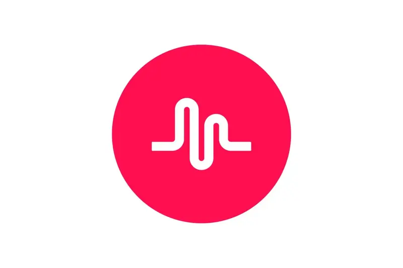
In 2017, ByteDance took its first step towards TikTok's global expansion. That same year, it acquired Musical.ly, a popular lip-sync video app in the United States. ByteDance incorporated Musical.ly's features into TikTok, enabling it to leverage its established American user base.
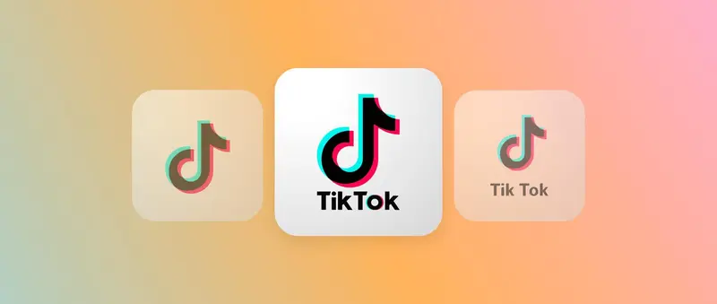
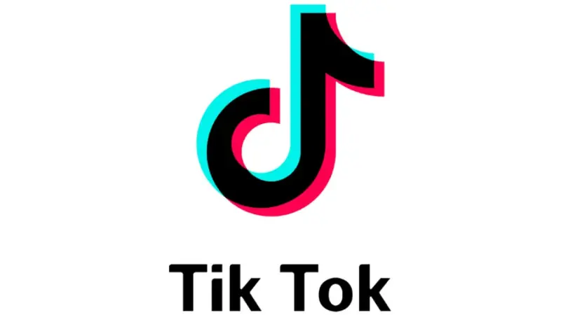
Around this time, an unknown designer created the original TikTok logo. It was a simple "d" mark resembling a musical note, in black on a white background, or white on a black background, with cyan and fuchsia accents giving it a dynamic feel. When TikTok expanded globally, the app name was added below the logo, split into two words: "Tik Tok".
From 2018 to the present
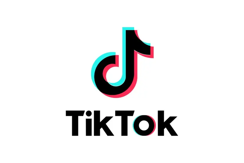
In 2018, TikTok further refined its visual identity. First, they revamped the typography. The new custom font is more aesthetically pleasing. They added cyan and fuchsia effects to the "o," creating visual harmony between the symbol and the text. This logo is still in use today.
Examining the meaning of the TikTok logo
While many social media companies collaborate with well-known design agencies, ByteDance took a different approach. In-house designers who love concerts and rock music positioned the platform as a virtual stage for creators and created the TikTok logo to match that image.
The designers drew inspiration from the contrast between a dark arena and bright stage lights. This resulted in the current design, where the main black lettering is surrounded by vibrant colors. The musical note shape has several intentions: it represents "Douyin" (which means "shaking sound" or "shaking music" in Chinese) and also functions as a lowercase "d" as a reference to the app name.
Comparison of TikTok logo and competitor logos
The TikTok logo helps differentiate it from its competitors.
Simple yet distinctive design
TikTok's simple yet bold design stands out among competitors with complex logos. While detailed designs need to be updated to keep up with trends, TikTok's simple approach is sustainable.
Strong brand recognition
The minimalist and bright logo is easily recognizable even on small screens. By avoiding excessive detail, it maintains a consistently modern look without requiring frequent updates. This consistency helps build strong brand recognition across all age groups.
TikTok is extending its visual identity beyond its logo. Using Sofia Pro for the header and Proxima Nova for the body text, it creates a consistent brand experience.
Dynamic visual elements
The TikTok logo cleverly represents the imagery of movement and sound that unfolds on the platform. The turquoise and magenta gradient evokes a sense of movement and creativity, while the black background highlights these colors. This dynamic approach sets it apart from the static logos of other social platforms.
📚 Resource: What is TikTok Shop? A complete guide to selling on TikTok
Why does the TikTok logo work?
A memorable logo is essential for building a strong brand. A logo increases awareness and allows a company to connect with more users. Here's why TikTok's logo is so successful:
- Clever use of psychological design and color theory: The TikTok logo is designed with bold black and white combined with vibrant cyan and fuchsia accents. This striking color combination creates depth and dynamism in the logo itself.
- Unique design: The combination of musical note shapes, concert-inspired colors, and clean typography creates an eye-catching and instantly recognizable design.
- Consistent Branding: By maintaining the same core design since its launch, TikTok has built strong brand recognition among its users.
📚 Learn more:
- TikTok Strategies for Businesses (2025 Edition)
Create a logo inspired by TikTok's success.
By understanding the secrets behind the effectiveness of the TikTok logo, you can apply those principles to your own brand. A well-designed logo helps attract people's attention and increase brand awareness.
Now that you're ready to create your own logo, let's get started with Shopify's logo maker. No design experience is required.
We're starting to sell on TikTok.
*The TikTok name and logo shown here are trademarks owned by TikTok Inc. and its affiliates. For more information, please visit www.tiktok.com.
FAQ about the TikTok logo
Is the TikTok logo a registered trademark?
Yes, the TikTok name and logo are trademarks. You can find more details in TikTok's intellectual property policy, etc.
Can I display the TikTok logo on my design?
No, you need written permission to use the TikTok logo. According to their design guidelines, this policy applies to all of their graphics, icons, symbols, and designs.
Why did TikTok change its logo?
TikTok has maintained its core logo design since 2016. Following its integration with Musical.ly, it made minor changes to the font and colors in 2018, aiming for a universal look that aligns with design trends.
Share this article
- Share on Facebook
- Share on X
- Share on LinkedIn